
data visualization
Why Building Footprints are More Accurate than Centroid Radii for Visit Attribution
Determining whether or not someone visited a location by using GPS data is trickier than it may first sound. Without a real-world reference point for the location being measured, it can be difficult to tell if someone actually set foot inside the building or property. They may have simply walked past, or even entered a neighboring building. This becomes especially problematic when dealing with properties that have multiple sub-units, such as malls or apartment complexes.
This visualization demonstrates how using building footprint data, versus using a radius based on the building’s centroid, gives a much more precise measurement of visits when combined with GPS ping data. Thus, having accurate polygon-based property data (such as SafeGraph’s Geometry), in addition to GPS and POI data, is essential for correctly attributing visits to retail stores and other buildings.
Store visit attribution is an important process for businesses, especially those with brick and mortar locations. There are two general reasons for this. The first is it lets a business see what share of the local foot traffic a particular store is getting, especially compared to nearby competitors. The second is it helps the business devise – and gauge the effectiveness of – strategies to increase that share of foot traffic. In other words, by getting its products in front of more of the right people, a store or business has a greater chance of making conversions.
A business has to start with an accurate understanding of how many people in a given geographic area are visiting its stores, how many are visiting the competition, and who these groups of people are. From there, a business can make marketing and other operations decisions – on a store-by-store basis or across the board – to either win more of its target audience, or shift to serve untapped demographics. Then it can compare the resources spent on these efforts against the change in attributions to see how successful their strategies are.
For example, a business may have one of its stores stock certain items or brands if they expect targeted local demographics to be interested in those kinds of products. It may also go further by having the store rearrange its displays to have those products in more accessible areas. It may even feature those products in more prominent places in its advertising materials for that particular store or area.
Another process that relies on accurately attributing visits is geofencing. This involves erecting a virtual perimeter around a location to count the number of people who cross into that area, as well as perform other automated functions when they do so. A common example is sending an advertisement as a notification to a person’s phone, informing them that a certain store is nearby and/or that store is holding a promotional event. As such, accurate visit attribution is necessary for correctly setting up geofences in the right places to target the right audiences. Without it, geofences run the risk of targeting demographics that aren’t interested in a particular business’s products, resulting in wasted advertising spending.
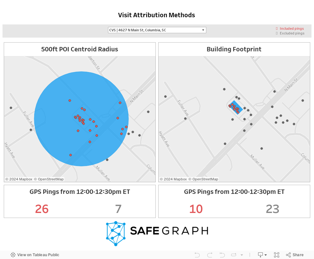
This visualization shows a comparison between visit attribution based on centroid radius data and building footprint data. As case studies, it uses dummy GPS signals measured near six CVS pharmacies, in various parts of the US, between 12:00 pm and 12:30 pm on the same day.
The panel on the left shows visit attribution based on a 500-foot radius from the centroid of the target store. The panel on the right shows visit attribution based on the target store’s building footprint polygon. For each panel, the blue highlight represents the area being measured for visits. The red dots are nearby GPS pings that are counted as visits, while the gray dots are GPS pings that are not counted as visits. These respective totals are represented by the red and gray numbers at the bottom of each panel.
You can click the drop-down menu at the top of the visualization to select another store case study to view. Using the controls at the side of each panel, you can zoom in and out, or hide/show specific data layers.
If you want to see more of what SafeGraph Geometry’s accurate and thorough geospatial data is capable of, try it out for yourself. Download a free sample here.
Store visit reports are sometimes created using centroid radii: buffer zones up to a certain distance away from the mathematical center of a property. While these are useful for proximity geofencing and analysis, they are poor for precise visit attribution because not many buildings have perfectly round shapes. So if a radius is too small, an analysis may have blind spots where people are on the property but are not being counted. Conversely, if a radius is too large, people who are in the general vicinity but not on the property – including in neighboring stores – could be counted when they shouldn’t be.
Using polygon-based building footprint data is the superior attribution method, because it constrains visit counts to the exact geometry of a building. As an illustration, consider the initial example above of a CVS pharmacy in Columbia, South Carolina. The store recorded 33 nearby GPS signals between 12:00 pm and 12:30 pm. Using a 500-foot centroid radius, it would be determined that 26 of those signals likely visited the store during that time. But measuring according to the store’s exact footprint data would show that only 10 signals were actually inside the store over that time span. That’s a difference of 16 visits – a significant margin.
This visualization uses SafeGraph’s Geometry data on building footprints and spatial hierarchies (i.e. sub-units within larger buildings) for millions of global points of interest.
You can get a free sample of Geometry data here.
Here’s another visualization that shows off the precision and versatility of our Geometry dataset:
Parking Lot Polygons – A map of parking lots corresponding to points of interest in and around Milwaukee, Wisconsin. Parking lots can be tricky to map correctly because they often have to be drawn around building footprints, and aren’t always in the immediate area of the points of interest they correspond to. So it can be difficult to both draw them accurately and also properly attribute them to the correct points of interest.