Mapscaping and SafeGraph Map Contest: Q&A with GIS Manager Sallie Vaughn
We love seeing our users put data to work—and we’re always game to shine a spotlight on new and innovative ways people are using SafeGraph Places data to solve big business problems.
That’s exactly why we launch the Mapscaping and SafeGraph Map Contest.
So today, we decided to chat with contest runner-up and GIS Manager, Sallie Vaughn to learn more about how she built a stunning visual model to analyze and understand the dynamics of the fitness center market in Brooklyn, New York. Then, to wrap up our Q&A, Sallie offered up a few useful tips for creating clear and simple presentations that make a huge impact.
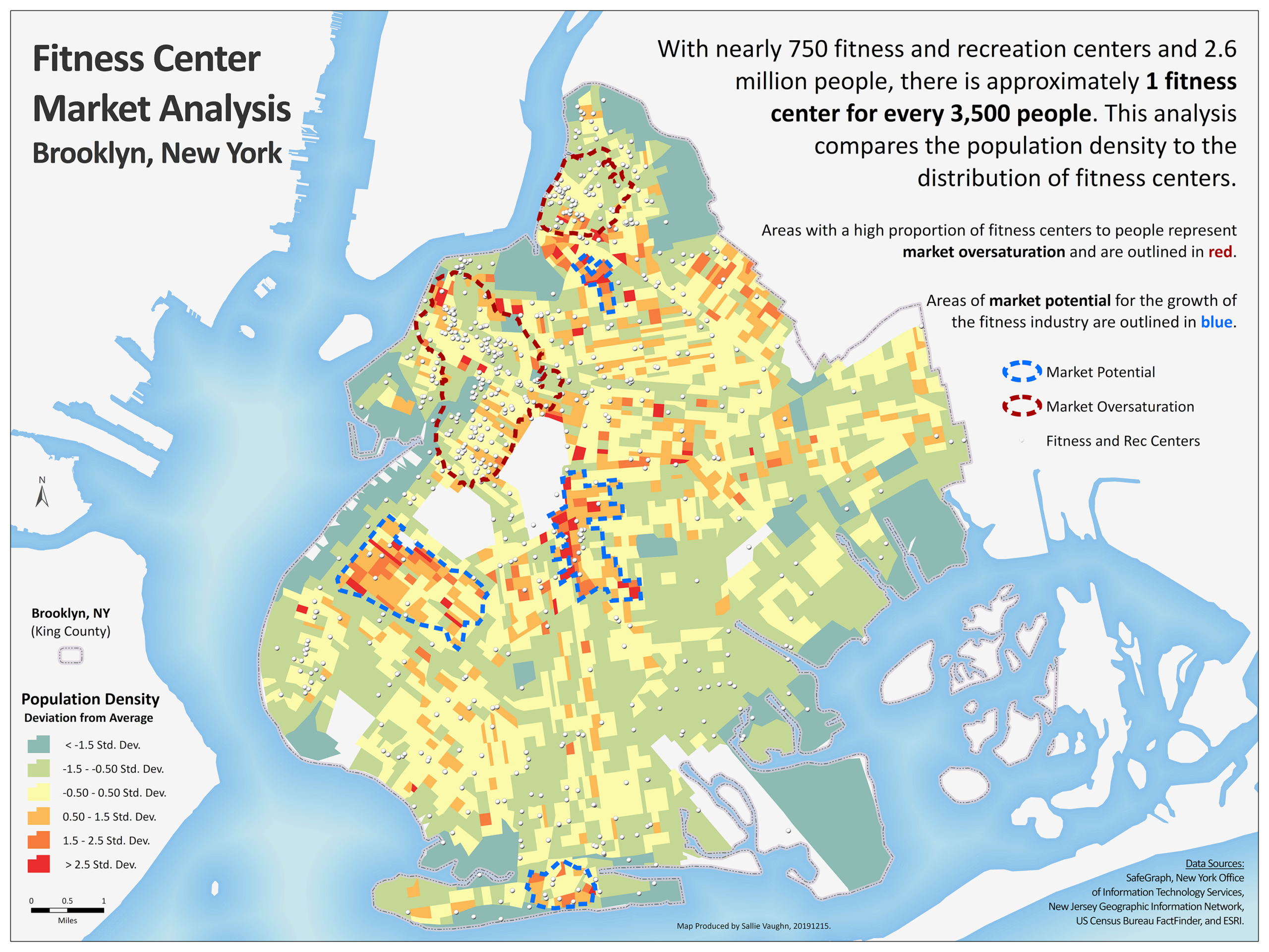
Before diving in, however, it’s worth noting that Brooklyn is home to nearly 750 fitness and recreation centers and a total population of 2.6 million people. This means there is approximately one fitness center for every 3,500 people.
Sallie’s density map (see below) was able to pinpoint with incredible accuracy where the market is oversaturated as well as where it has significant room to grow—great insights for anyone looking to open up a new fitness center and/or compete in the Brooklyn market. This is also helpful for anyone who works in economic development; using data to develop visual representations of real world market dynamics can fuel innovation and provide insights that impact decision-making in a big way.
If you can’t tell, we loved everything about Sallie’s map creation. But don’t just take our word for it. Let’s take a moment to hear from Sallie herself.
Tell Us a Little About Yourself.
“I’m Sallie Vaughn, GIS Manager for Person County, North Carolina. As a GIS professional with 13 years of experience in location analytics, cartography, application design, and database management, I’m passionate about presenting information in a clear and compelling way.
I’m always looking for new challenges and love solving problems with the right map. When I’m not working, you can find me playing the euphonium, biking, or hiking with my husband, Evan.”
What Inspired You to Enter the SafeGraph Map Contest?
“I love getting the chance to showcase information in new and interesting ways. We don’t get to do this all that often in local government; we tend to generate maps that aren’t as visually impressive as they could be. We mostly recreate maps based on printed documents from decades ago, so we don’t have much leverage to be creative.
That’s why working on this project was so much fun. I wanted to dig into a complex question about the fitness industry and create a map depicting the areas of market saturation and potential growth for fitness centers in Brooklyn, New York.
Fitness is an important part of people’s lives, whether for people wanting to stay healthy or for businesses looking for ways to serve their needs. I really enjoyed being able to take a closer look into the numbers to reveal some useful insights about the market as a whole.”
What Drew You to Fitness Centers?
“As a GIS Manager in local government, I regularly work with our economic development staff to analyze and depict areas of saturation and potential growth for various sectors of business and industry. Naturally, most of my work focuses on Person County, but I’m also fascinated by how to find and use data—especially point-of-interest (POI) data—on other locations.
In this case, focusing on fitness centers in Brooklyn was a natural extension of these interests. I was looking for an enjoyable challenge that would also give me a good reason to work on my cartography skills. Plus, this was a great opportunity to use a little creativity.”
Talk Us Through Your Process.
“For data exploration, I started by importing SafeGraph data to ArcGIS Online. This provides the easiest and quickest way to symbolize and filter data based on attributes and then examine patterns of market oversaturation. ArcGIS Online allows you to quickly overlay population data with market data, which is useful with a complex analysis like this.
Personally, I’ve always noticed that once one gym pops up somewhere, several other gyms will pop up right next to it. This makes me wonder how marketable and sustainable those businesses really are.
To answer this question, I chose the NAICS (North American Industry Classification System) Code for fitness centers and spent some time digging into it to see what I could find.
Like a lot of GIS folks, I can get lost for hours in a good dataset! So, once I chose a subset, I decided to stick with it. What you see on the map is the end result of all that digging.”
How Did You Build the Map with That Data?
“ArcGIS Online is great for initial data exploration, but I needed something different for making the map itself. So, I decided to import the data into an ESRI geodatabase and then develop the map with ESRI’s ArcGIS Desktop v. 10.6.
After downloading raw population data for New York from the U.S. Census Bureau, I calculated the average number of fitness centers per person and determined the standard deviation. Then, I ran several different kernel densities to model the density of fitness centers. Once I had this information, I could begin depicting areas of market saturation and areas of potential growth.”
How Did You Land on Particular Design Features?
“When it comes to building maps, I always let the subject guide the design aesthetic. The shape of Brooklyn lends itself well to a portrait orientation, so I created the map as an 18-inch by 24-inch document. I also added details, such as text boxes and legends, in all the right places to enhance the look and feel of the map without overshadowing the most important information.
One of the biggest challenges was finalizing the map colors. Typically, I’m only trying to depict either oversaturation or growth potential on a map—not both at the same time. This required me to choose colors that could convey the information in a simple and visually-appealing way. I actually went through a lot of iterations before choosing the final colors.
I am thrilled with the end result. I really feel this challenge gave me an opportunity to offer clear insights about a subject that is both complex and personally interesting to me.”
Telling Great Stories Requires the Right Data
Trends and patterns, like economic development in urban areas, can be tricky to turn into clear and compelling stories. Not to mention, it can be really easy to get lost in the most minute details when working with complex sets of information.
The good news: SafeGraph data and state-of-the-art GIS technology combined make it possible for anyone to make powerful and informative maps on pretty much any subject imaginable.
In Sallie’s case, she relied on clean and accurate POI data to identify the parts of Brooklyn currently underserved by fitness centers and to offer up clear insights about where there’s the most room for potential future growth. This is a great example of how data can be used to understand, anticipate, and address a local population’s growing needs.
A big thanks to Sallie for letting us share both her story and her fantastic map!
Make your own map!
If you work in economic development, urban planning, or any area involving data-driven decision making, you know just how important it is to have access to good, clean data.
SafeGraph Places data is packaged up monthly in a well-organized CSV file (with release notes) to ensure you always have access to the most accurate and updated information available. Plus, as an added perk, it’s super easy to use with ESRI, the world’s leading GIS technology platform.
Has this story inspired you? Ready to make your own map? Let SafeGraph get you moving in the right direction. Contact us to learn more!