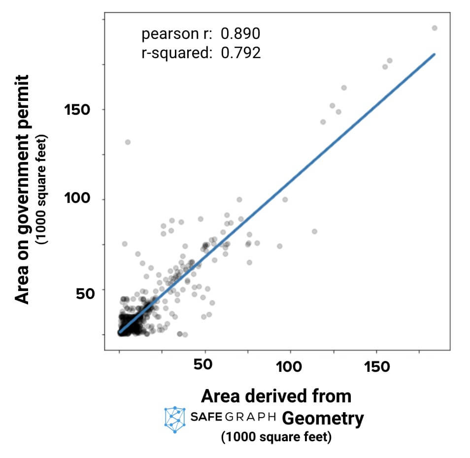
Areas inferred from SafeGraph correlate with government datasets as high as 0.89.
For a working demonstration showing how to calculate square footage from SafeGraph Geometry polygons, see this Python Jupyter Co-Lab notebook.
If You Could Know One Fact About a Retail Location to Understand the Business, Would It Be Square Footage?
Knowing the square footage of a retail Point of Interest (POI) is an informative proxy for all sorts of details about that location. Is the POI located in a dense urban environment with a high premium on square footage or a suburban strip mall where retail centers can afford larger buildings? Coffee shops have very different square footage compared to big-box retailers (which in turn are different than major corporate chain restaurants, etc.).
You Can Calculate Square Feet from SafeGraph Polygons
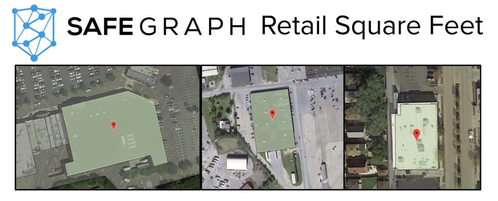
Although square-feet is not an explicit attribute reported in SafeGraph Places, the SafeGraph Geometry product features detailed geospatial polygons of the building footprint (see pictures above). It’s very easy to calculate square-footage from these polygons.
We have a working demo showing how to calculate square feet in this Python Jupyter Co-Lab notebook.
Want to re-create this chart yourself and dig into the details? Curious about those outliers? Want to analyze the correlation by category? Read the full post and customize the ready-to-run code at the Python Jupyter Co-Lab notebook (it runs in your browser!).
When SafeGraph and the Government Disagree, Who Is Right?
Although the overall correlation is very high, there are still notable outliers. When SafeGraph and the government data disagree, who is right and who is wrong? We investigated the top ten largest discrepancies one-by-one. Of the top ten largest differences, 5/10 of the errors were clearly in the government dataset and 5/10 of the errors were in the SafeGraph data. Room for improvement on both sides! And you better believe SafeGraph is working hard on it! Nonetheless, the overwhelming result is that SafeGraph data correlates strongly with data reported by the government on food-permit licenses.
To see a detailed analysis (with pictures!) of the top ten largest disagreements between SafeGraph and the government data, check out the Python Jupyter Co-Lab notebook.