
Once your map is built, the real value comes from what you measure inside it: population, competitor overlap, and market penetration.Most teams either eyeball a radius around a store on Google Maps, or skip catchment mapping altogether because it sounds like something only a GIS specialist or data scientist can do. Neither approach holds up once real money is on the line for a new lease, a marketing budget, or a site selection decision.
This guide fixes that gap. It walks you through building an actual catchment area map using a free tool, with no coding and no GIS background required, then shows you how to go further with drive-time isochrones and mobility-based trade areas once you’re ready for more precision.
What Is a Catchment Area Map?
A catchment area map is a visualization of one or more catchment areas, the geographic zones from which a business, service, or facility draws its customers or visitors. It’s built by plotting store or facility locations, then drawing a boundary around each one using distance, travel time, or observed visitor movement.
Catchment maps are used for site selection, competitor analysis, market penetration studies, and targeted marketing. For a deeper look at what a catchment area is and how it differs from a catchment zone, see our complete guide to catchment areas.
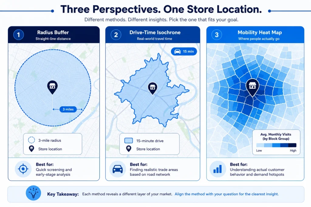
The 3 Ways to Define a Catchment Area
Before you open any software, decide which method fits your question. Each one trades off accuracy against effort and data requirements.
Method | Accuracy | Data needed | Best for | Effort |
Buffer (distance ring) | Low. Ignores roads, rivers, and terrain | Store location only | Quick first-pass screening, franchise territory planning | Low. Minutes in any GIS tool |
Drive or walk-time isochrone | Medium to high. Follows real roads | Store location plus a routing engine | Site selection, service-area mapping | Medium. Needs a plugin or API |
Mobility-based (true trade area) | Highest. Based on observed visits, not assumptions | Store location plus a licensed mobility dataset with home CBGs, joined to a verified POI source | Competitive benchmarking, validating assumed catchments | Higher. Requires licensed mobility data |
For a deeper breakdown of each method, including worked examples and the Huff gravity model, see our 3 methods of calculating catchment areas post.
What You’ll Need
- Location points. The address or coordinates of the store, clinic, or facility you’re mapping.
- Competitor or POI data. SafeGraph Places is a good source if you need competitor locations at scale, with 80M+ verified points of interest, 15,000+ brands, and 900+ categories worldwide.
- Demographic data (optional but useful). Census or ACS data to profile who lives inside your catchment.
- A GIS or BI tool. QGIS is free and used in the tutorial below. ArcGIS Pro, Kepler.gl, or CARTO work too if your team already has access.
Tutorial: Build a Drive-Time Catchment Map in QGIS
QGIS is free, open-source, and doesn’t require a login. Download the LTR (long-term release) version from qgis.org for the most stable experience. You don’t need a sample dataset for this. Use your own business address, or any address you want to test with.
Step 1: Gather your location data
Write down the address (or latitude and longitude) of the location you’re mapping. If you want to compare against competitors, pull a short list of their addresses too.
Step 2: Set up QGIS and add a base map
Open QGIS, go to the Browser panel, and add a basemap through the XYZ Tiles connection (OpenStreetMap works well and is free). This gives you streets and landmarks to orient your map.
Step 3: Plot your location
Install the free MMQGIS plugin (Plugins > Manage and Install Plugins, search “MMQGIS”). Use its geocoding tool to turn your address into a point on the map. If you already have coordinates, you can add them directly as a new point layer instead.
Step 4: Choose and run your method
For a buffer: go to Vector > Geoprocessing Tools > Buffer, select your point layer, and set a distance (for example, 1, 3, and 5 miles). For a drive-time isochrone: install the ORS Tools plugin, sign up for a free OpenRouteService API key, then run Isochrones from the ORS Tools panel with your point as the origin and your time thresholds (for example, 5, 10, and 15 minutes).
Step 5: Layer in competitor or demographic context
Add your competitor address list as a second point layer to see who falls inside or outside your boundary. If you have census data, join it to your catchment polygon to see population counts.
Step 6: Style, label, and export your map
Symbolize each ring or isochrone with a distinct color, add a legend, a scale bar, and a title through Project > New Print Layout. Export as a PNG or PDF for sharing.
That gives you a working catchment map built entirely with free tools and your own data.
Tutorial Variant: Mobility-Based (“True”) Trade Areas
Buffers and isochrones tell you where customers could theoretically come from. Mobility data tells you where they actually come from, which is why it’s considered the most accurate method. This requires a licensed mobility dataset, but the workflow is straightforward once you have access.
Step 1: Get store visit data with home origins
A licensed mobility dataset from a third-party provider links store visits to the visitor’s home census block group (CBG). SafeGraph does not sell this type of data itself, but it does enable this kind of analysis by supplying the verified POI layer you join the visit data to.
Step 2: Join visits to your store location
Filter the dataset to visits at your specific POI or brand.
Step 3: Aggregate visits by origin CBG
Group the visit counts by home CBG to see where your actual customer base is concentrated.
Step 4: Symbolize by visit volume
In QGIS, Kepler.gl, or a BI tool, shades each CBG polygon by its share of total visits. This produces a heat map of real customer origin, often revealing a catchment that’s smaller, more irregular, and more transit-corridor-shaped than a buffer or isochrone would suggest. If your provider includes it, layer in co-visited brands or dwell time for a segmentation layer on top. Our mobility data guide covers what these datasets typically include and how they’re sourced.
What to Analyze Inside Your Catchment
Building the map is step one. The map only becomes useful once you measure what’s inside it.
- Population and households. How many people live inside your catchment, and how does that compare to the population needed to support your location type?
- Competitor count and density. How many direct competitors sit inside the same boundary, and how close are they to your location?
- Overlap and cannibalization risk. If you’re evaluating a new site near an existing one, calculate what percentage of the two catchments overlap. Overlap above roughly 25 percent is generally worth a closer look before committing to the new site.
- Market penetration. Estimated customers divided by total addressable population inside the catchment gives you a rough penetration rate, useful for spotting under-served or oversaturated areas.
Worked Example: Drive-Time Catchment for a Costco in California
To make this concrete, here’s how the pieces come together in practice (figures below are illustrative, not an audited case study).
A 10-minute drive-time isochrone around a Costco location in California captures a population base in the low hundreds of thousands, shaped less like a circle and more like a stretched polygon that follows the freeway corridor and pulls back sharply where a mountain range or a lack of connecting roads gets in the way. Overlaying a second Costco’s 10-minute isochrone roughly 12 miles away shows almost no overlap, a healthy sign with low cannibalization risk. Adding competitor warehouse clubs inside the same boundary shows two locations within the 10-minute drive time, giving a rough sense of the competitive pressure the location faces. That combination, population reach, low internal overlap, and moderate competitor density, is the kind of read a catchment map is built to deliver.
Closing Thoughts
A catchment area map is only as useful as the method behind it. A buffer gets you a fast first look, a drive-time isochrone gets you something closer to how customers actually move, and a mobility-based map, when you have access to real visit data, gets you the truth. Start with whichever method matches the decision in front of you, and treat the map as a living asset you revisit as competitors open, roads change, and your own footprint grows.